The brand
First, we needed to align ourselves with the company objetives. We traced a overall User Experience and Marketing strategy and divided the work in manageable chunks we could release constantly.
The brand needed to be refreshed, the app needed to change to accommodate new features and we, as a team, needed to elevate our UX maturity.

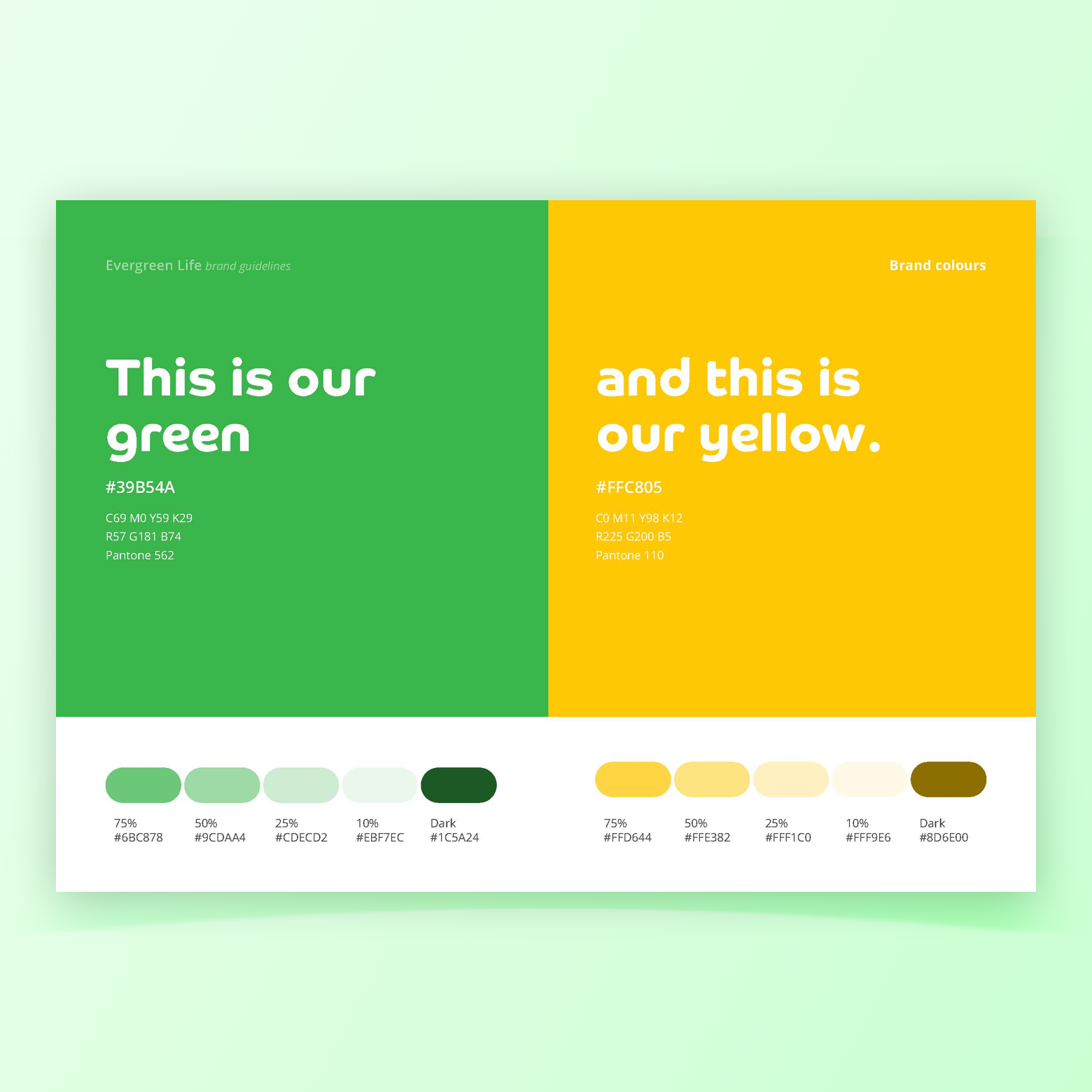
A refreshed brand for a refreshed company


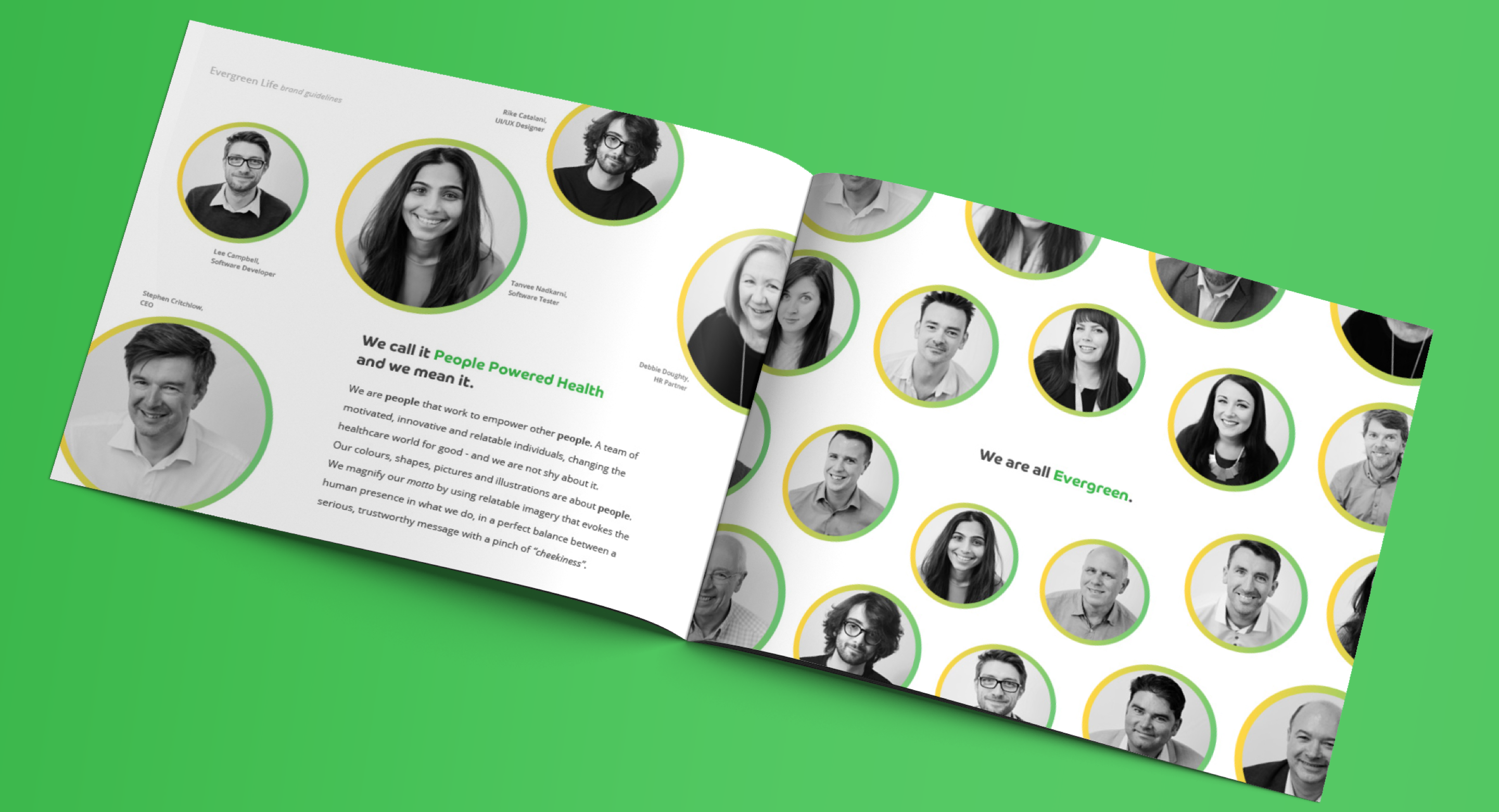
The tone of voice needed to send the message that we were real people behind a people powered health company.
The changes introduced made the brand more inviting, at the same time we expanded the brand target age, now divided by market sector.
It's a common misconception that UX is solely concerned of "websites and apps". A true inviting brand need to also be accessible - that's why we promoted changes to our branded assets, typography, colour scheme and iconography.


DNA testing to make your health truly personal

After the initial trials, we've promoted a refresh of the DNA testing product. We identified what were the shortcomings of the products (such as poor e-commerce experience) and took the initiative to redesign everything.
To create an easy-to-understand experience, we've liaised directly with out DNA and health experts to divide the insights into four main areas: Fitness, Diet, Skin and Metabolism.
The re-launch of the service was a huge success. A joint effort of design and marketing increased the sales in around 2000% (yes, you've read that right).
You can see in the images some of the collaterals redesigned, such as the testing kit packaging, and a new interface for "registering" your DNA test.
It's been a while since the work you see here, so you can have a look at Evergreen Life's current DNA offering.


Additionally, all customers touch points were redesigned to include links to help articles and supporting content.
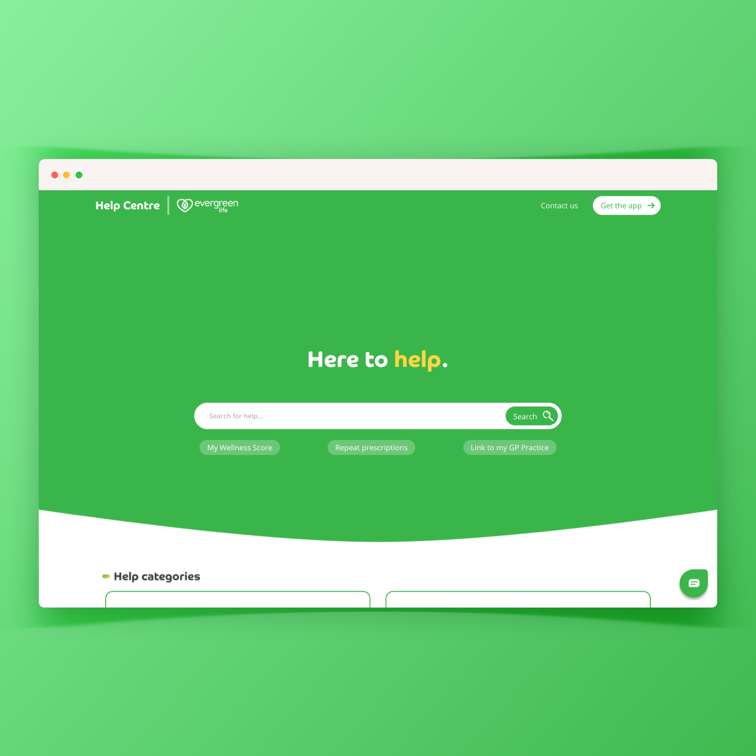
You can imagine how, in a space of a few weeks, going from a few hundred users to 1m+ users caused a huge influx of support queries. The creation of the Support Portal was essential to retain the customers. It also served as a way to collect real user feedback.
See it with your own eyes: access the Evergreen Life Support Portal.

Evergreen Life app: wellness reinvented.

The introduction of the Wellness Score was a way to drive more engagement with the app health questionnaires, and other functionalities things such as book GP appointments, access their medical records and order DNA testing kits.
More and more users flooded as we made the 1 million users mark during my time there.
In one of the pictures you can see my awesome colleague Matt photobombing in one of the many UX workshops we ran.
Check out the Evergreen Life app in the iOS app store for iPhone and iPads and Google play store for Android devices.


Other parts of the app were redesigned, such as messages. That's when we started to introduced more illustrations to make things a little more friendly.
I loved designing the omnibar because we were trying to address direct user feedback after conducting UX research. I believe some of the designs shown here didn't mkake the cut before I left Evergreen for new pastures.


