This page is under construction. Text and images are not final.
You can learn more about Telus SmartHome here.
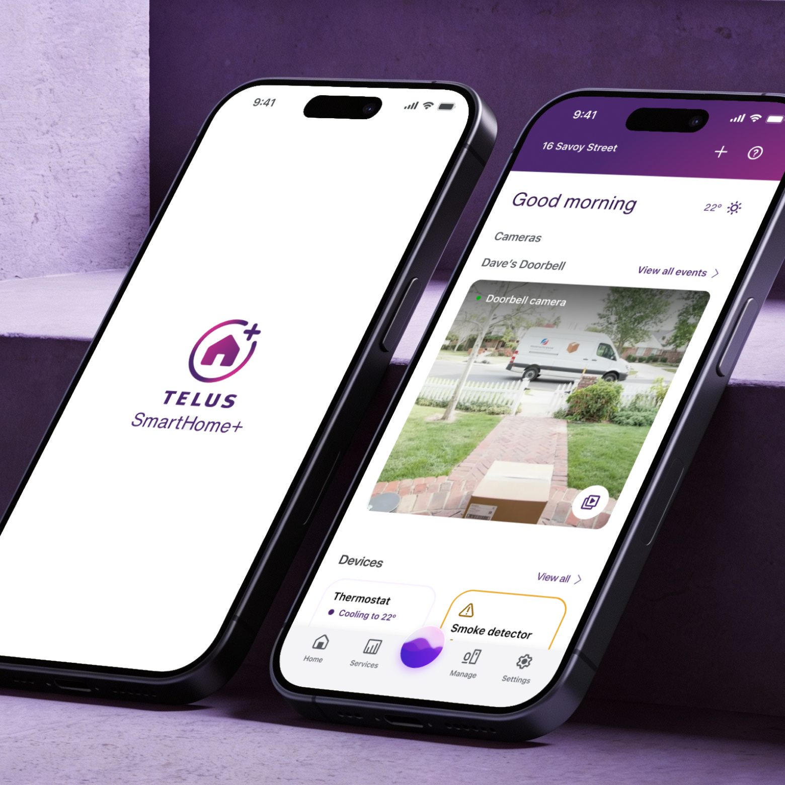
What gives SmartHome+ its edge is that it sits inside the TELUS ecosystem — meaning users who already rely on TELUS as their internet provider get smart home control built right in. That existing relationship is what gave the app its large, established user base from the start. By the time I joined, the product was already mature and widely used across Canada. My focus was on making that mature experience feel even more cohesive — across security cameras, real-time alerts, device control, automation, and energy monitoring — all designed to feel calm and approachable, not technical.

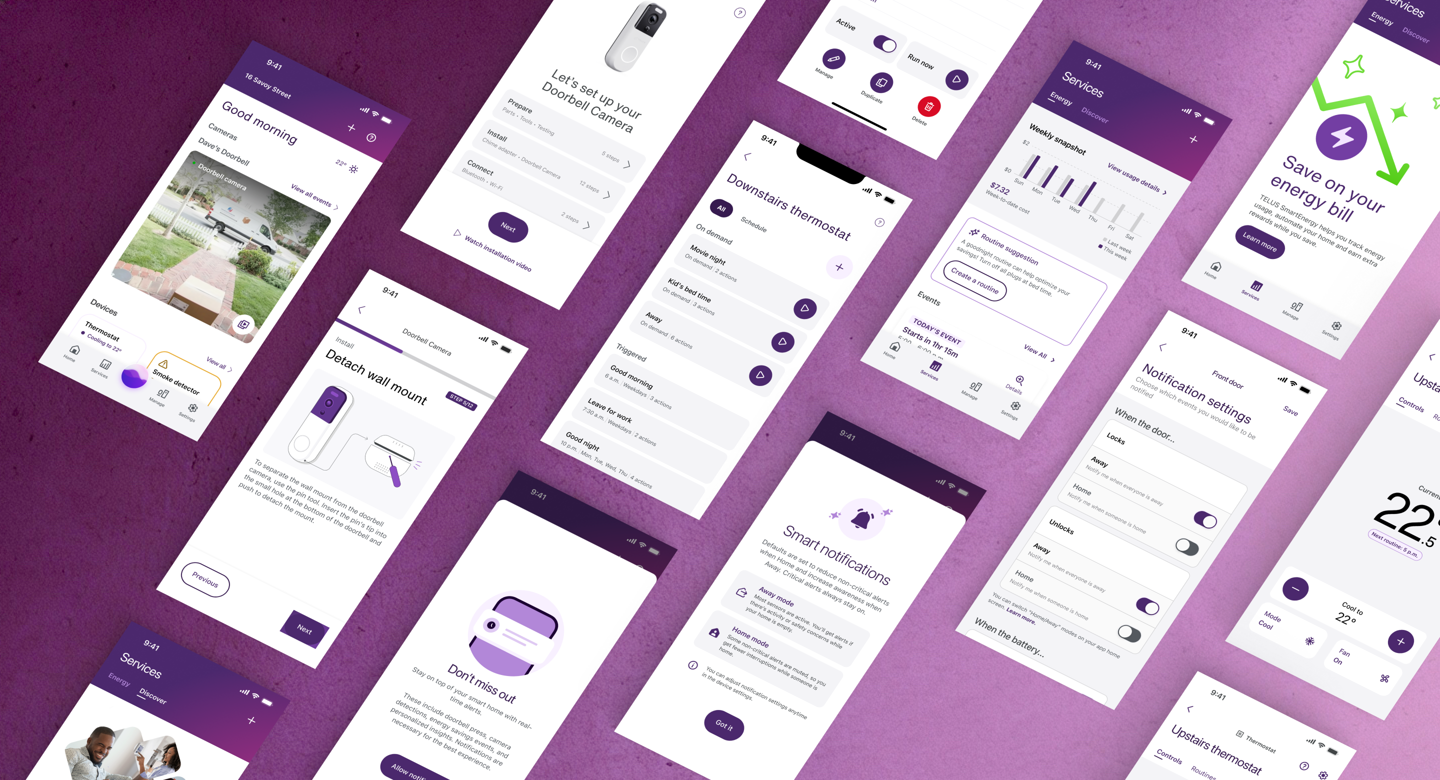
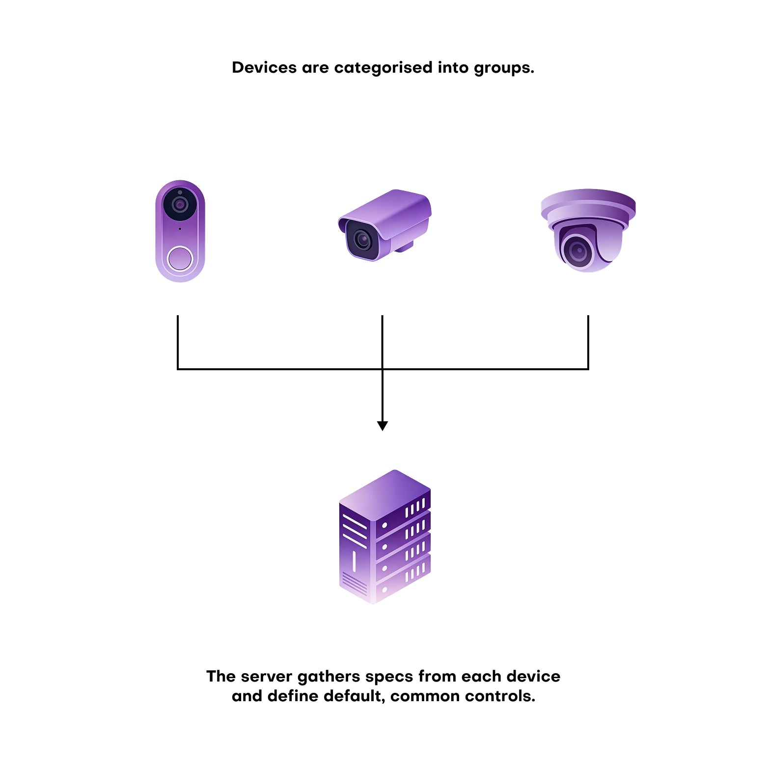
Every new device brought its own behaviours, states, and edge cases. Multiply that across different brands, connectivity standards, and platforms, and small inconsistencies start to pile up fast.
A lightbulb control looks different from a thermostat control, which looks different from a security camera — and none of them were originally designed to live in the same interface. The cracks weren't always visible on a single screen — but across the full app, they added up.
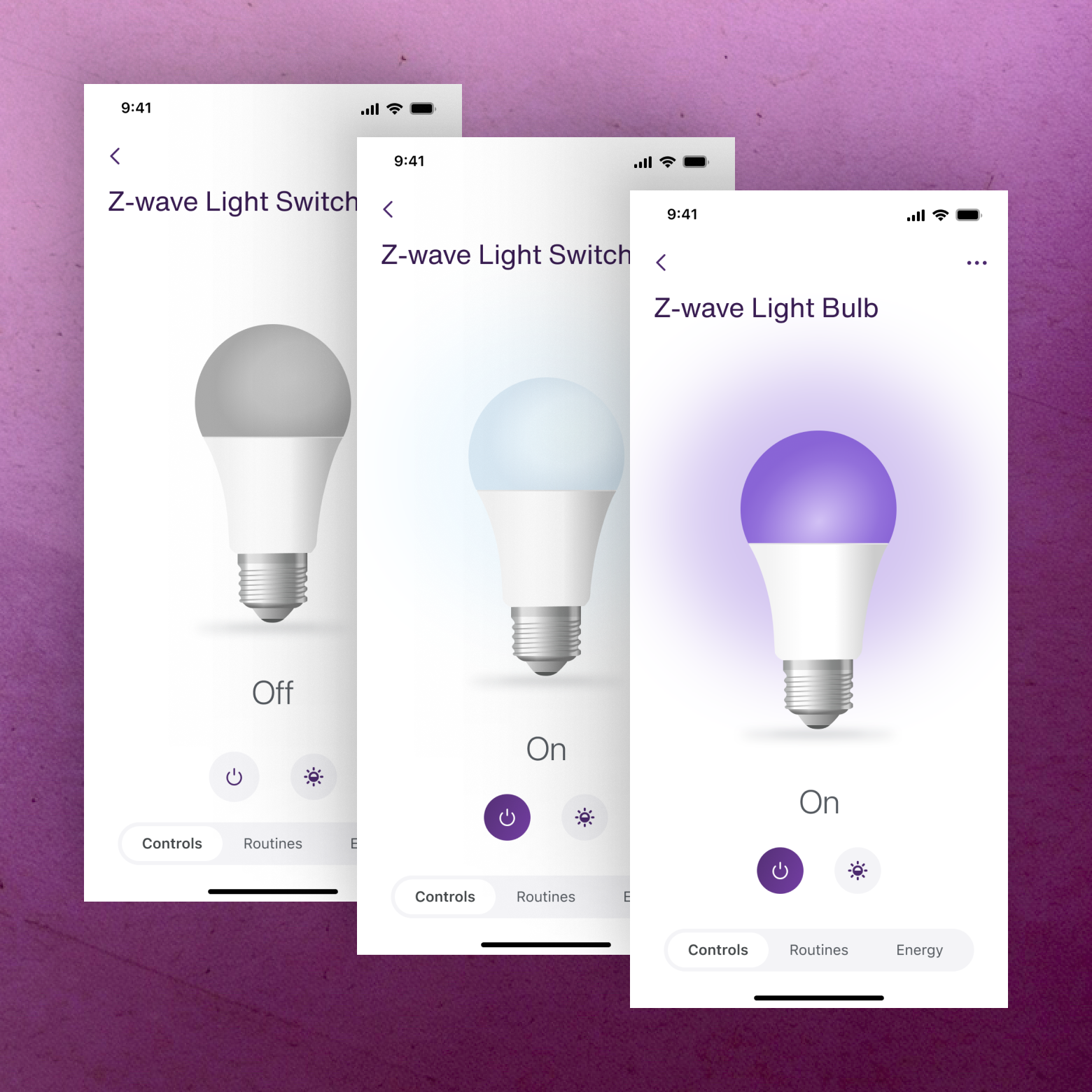
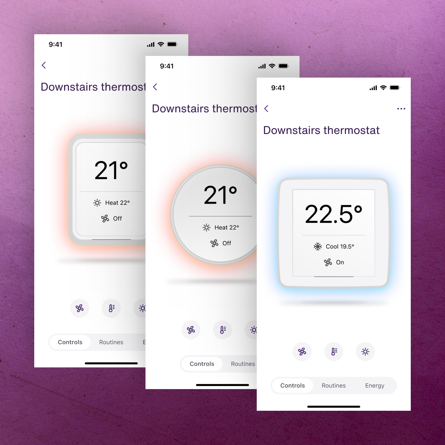
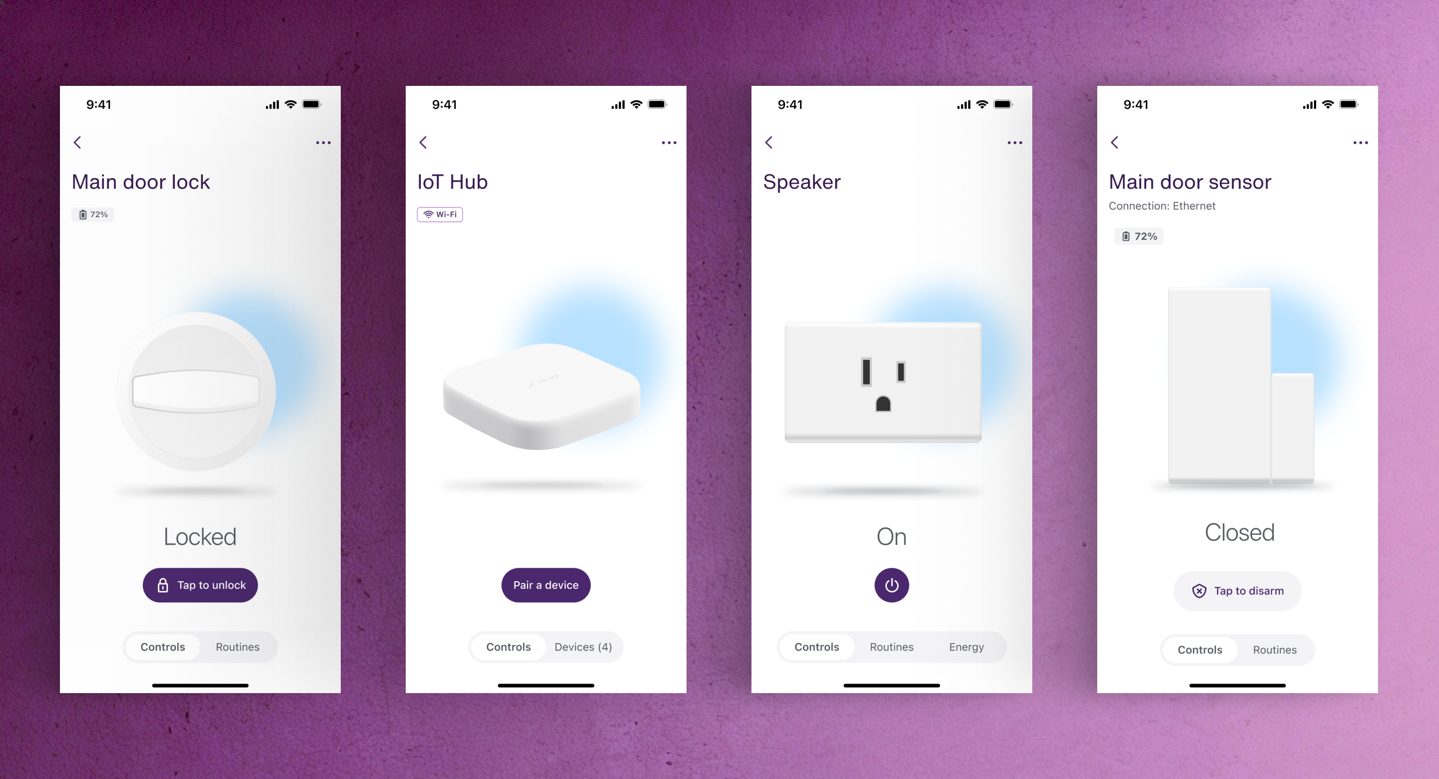
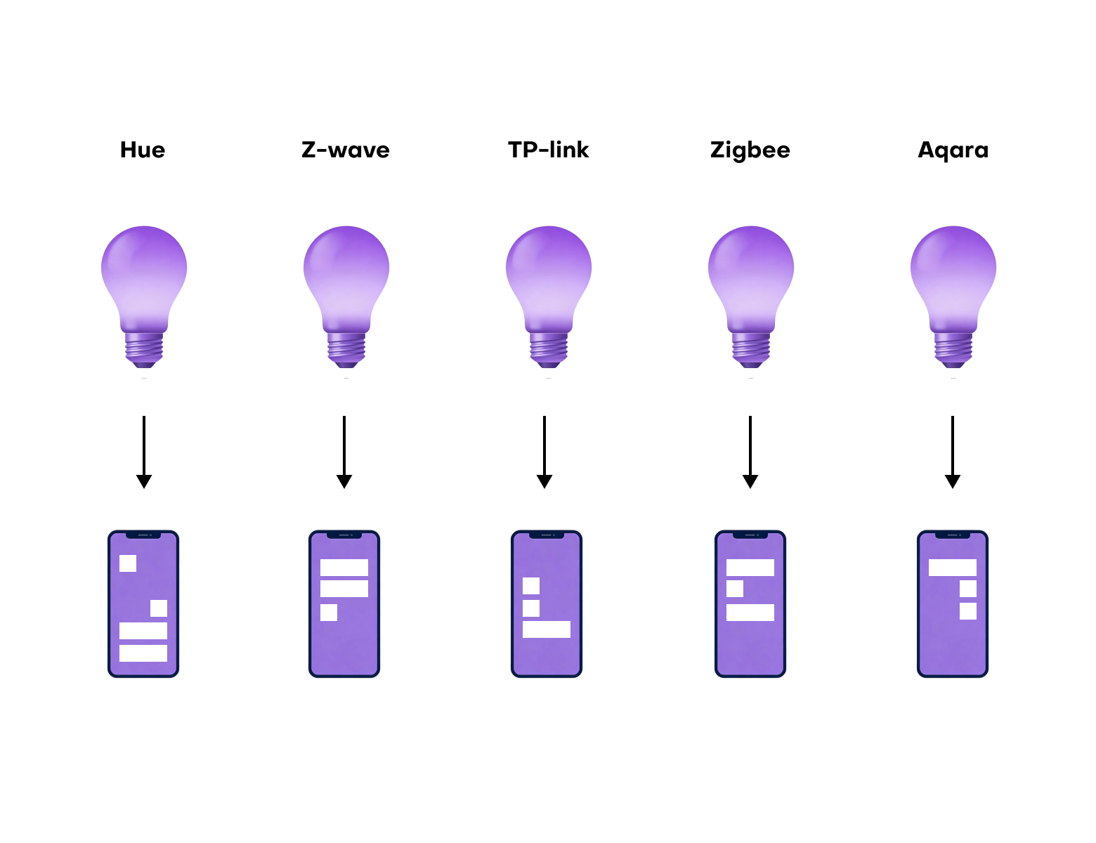
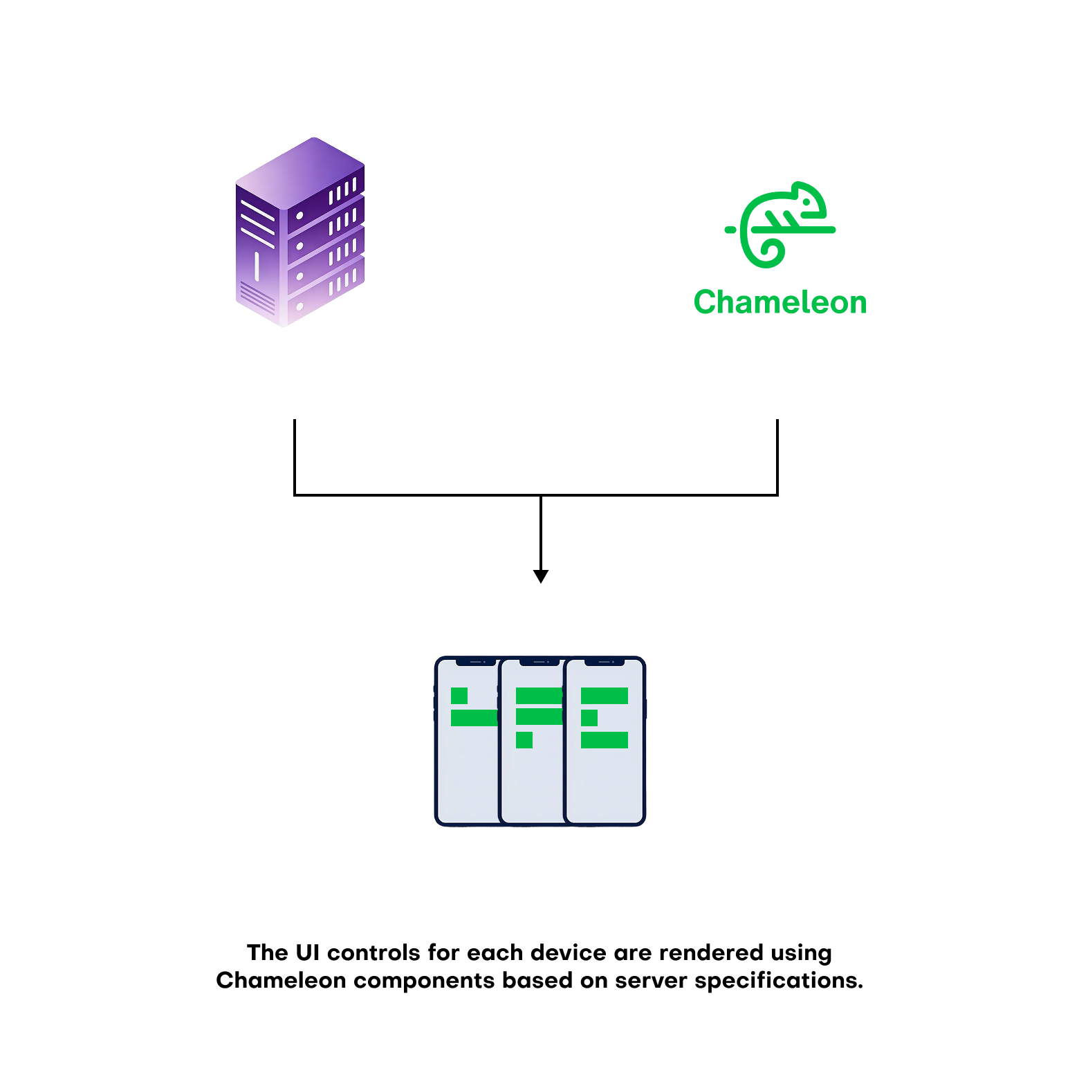
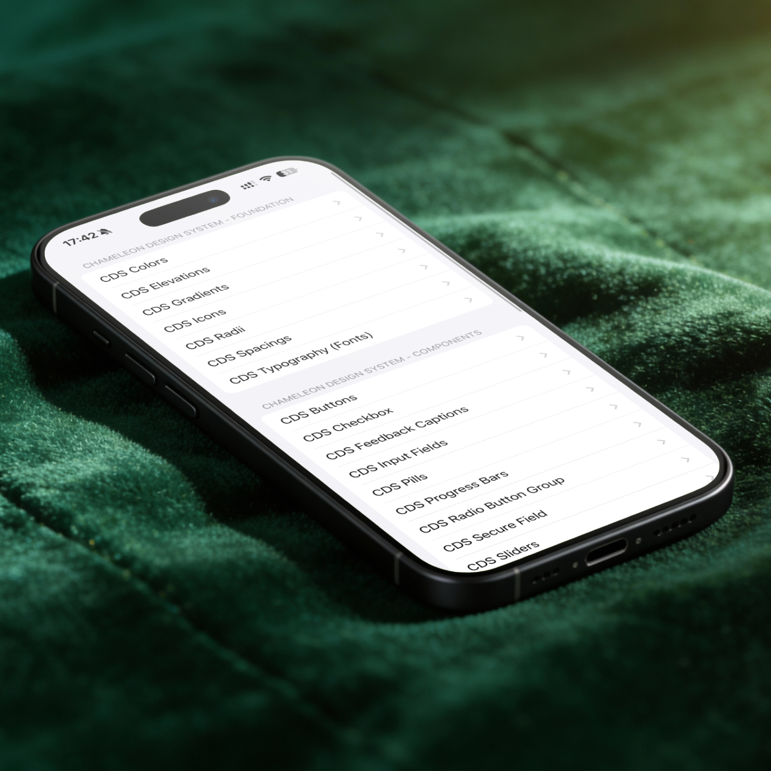
Each device category had been designed in isolation, with its own patterns, its own controls, and its own logic. What we needed was a single UI system agnostic enough to power any device — whether a lightbulb, a thermostat, a smoke detector, or a smart lock — without having to start from scratch every time.
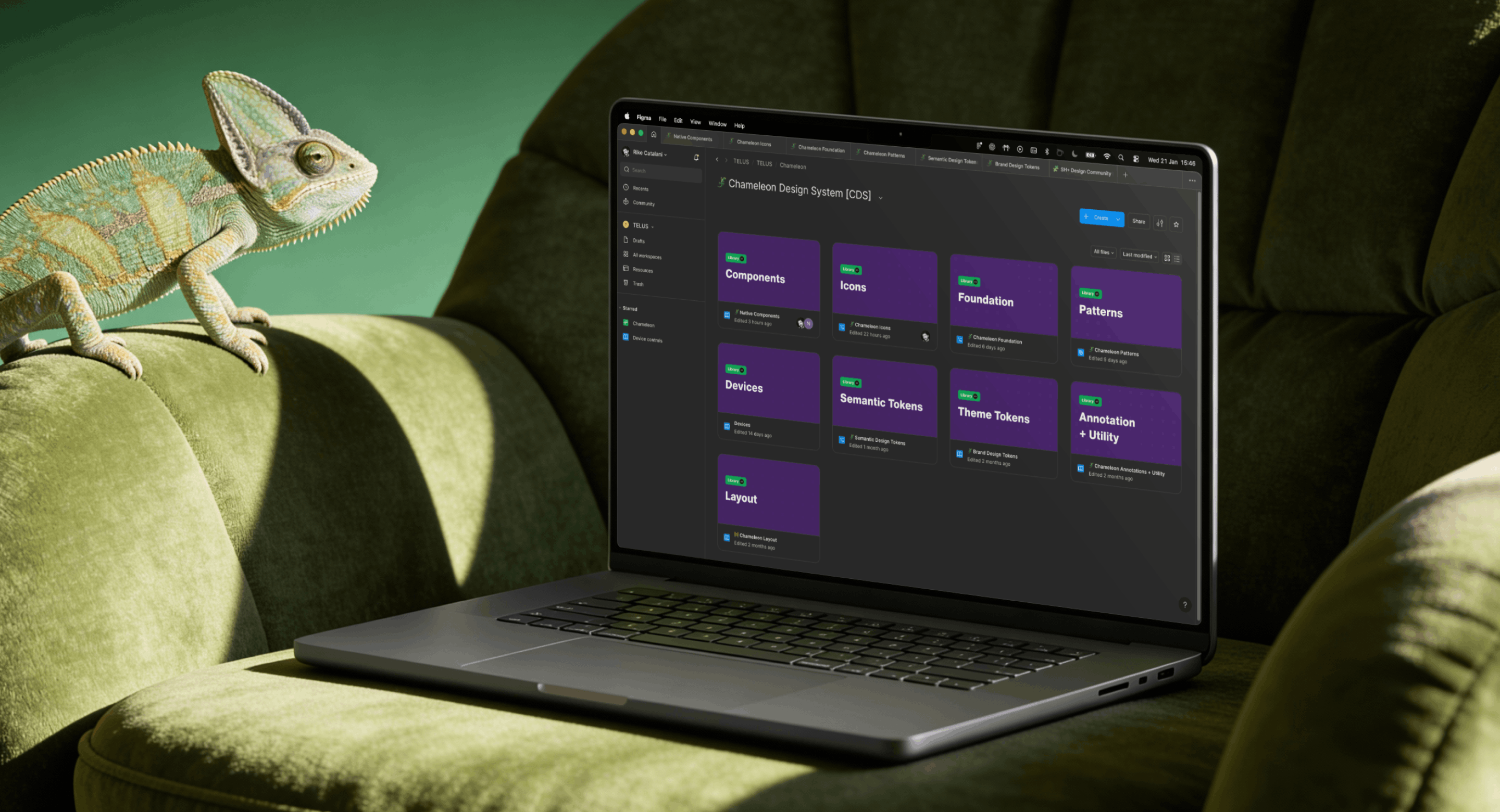
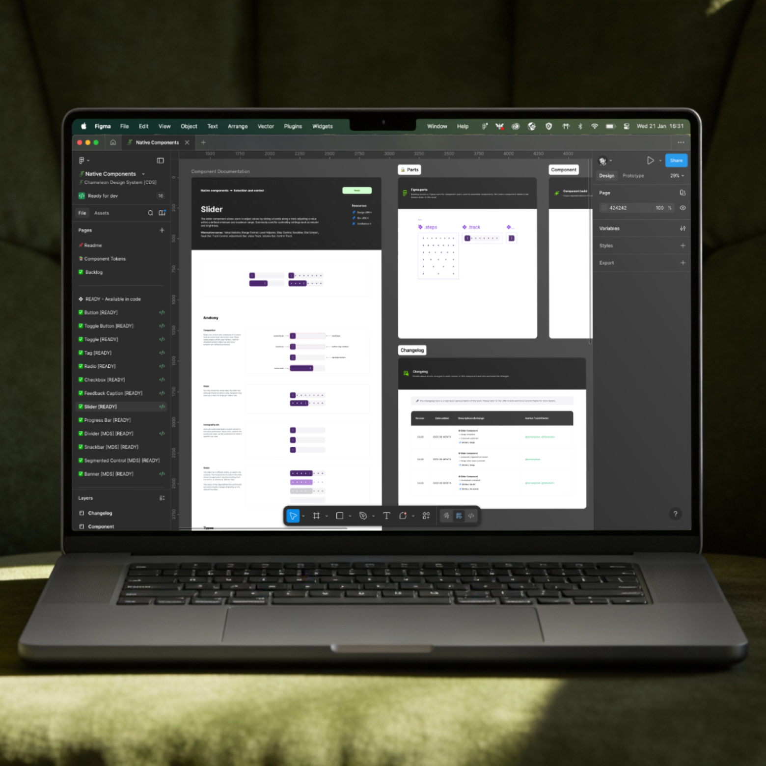
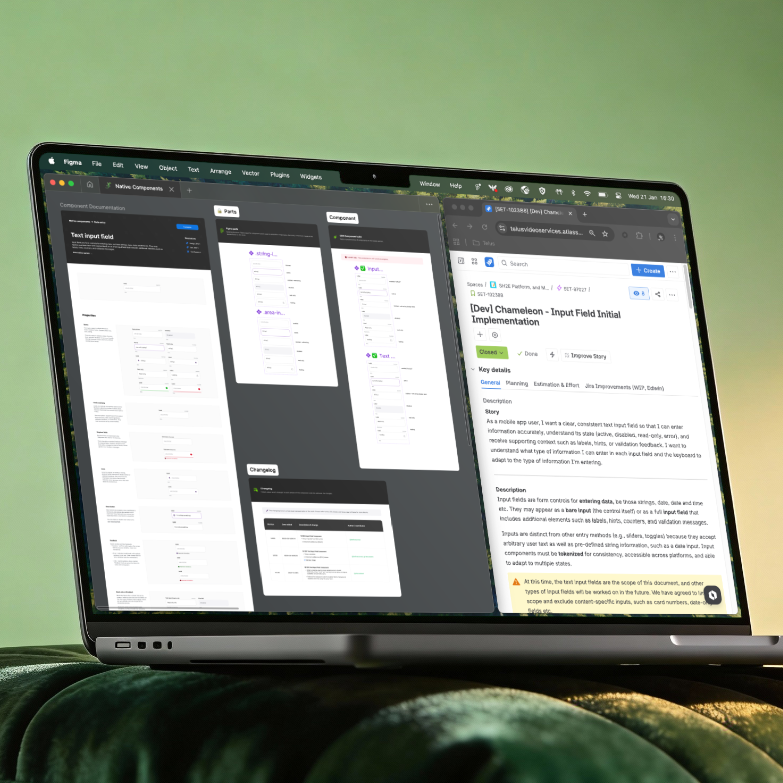
The existing TELUS-wide design system wasn’t designed for highly dynamic, device-driven interfaces. Chameleon evolved from that foundation into a more flexible, token-driven system tailored specifically to Smart Home. A big part of my work here was defining clear rules and thresholds — not just what components exist, but when and how they should be used — in close collaboration with core engineering. Flexibility was essential, but unbounded flexibility would have quickly undermined consistency.
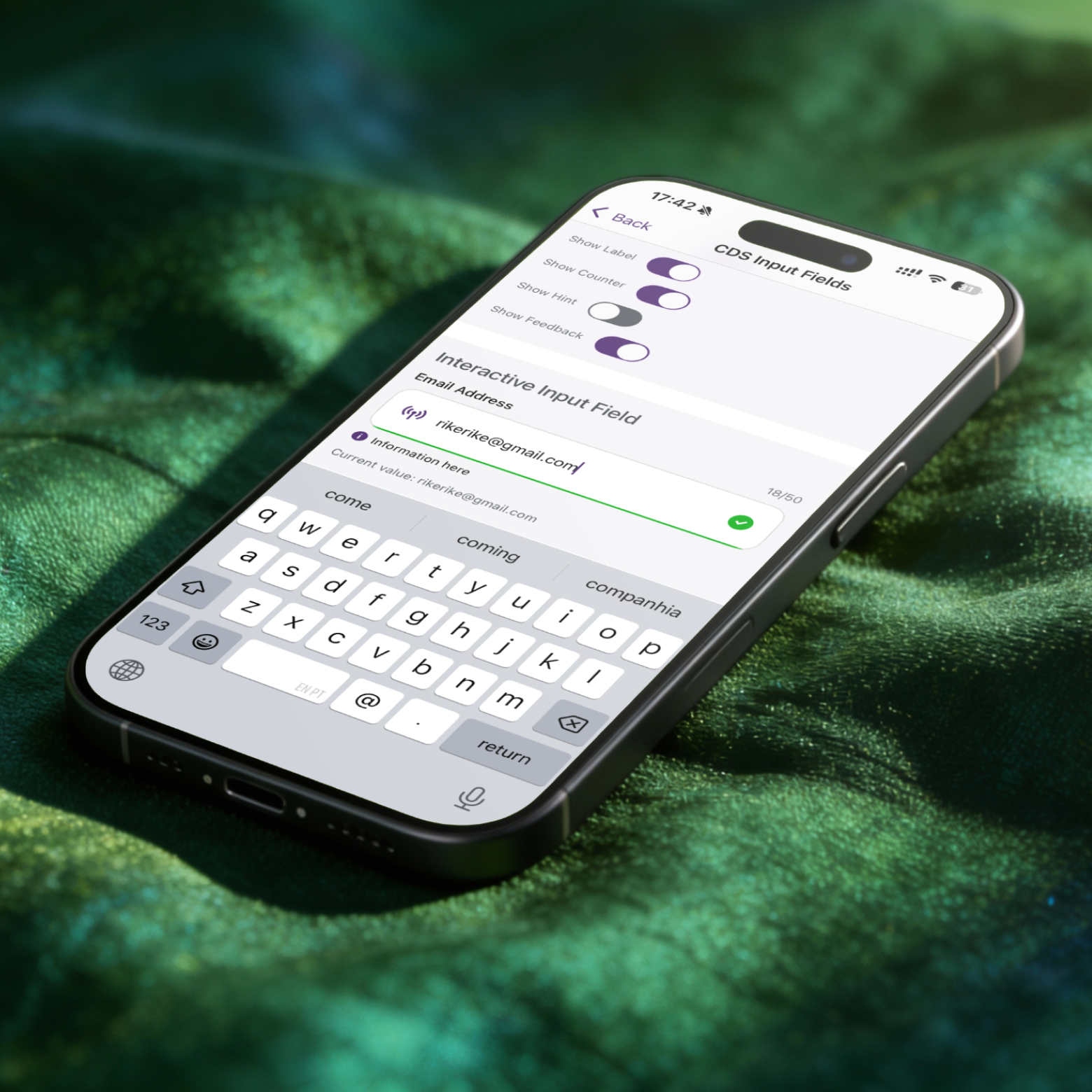
For instance, different surveillance cameras from different brands would display similar controls. If we created agnostic UI components in the Design System, those may be used to control different camera types.
We still have to test the design of device control screens and how each control component would fit and interact in the layout. But we were able to break down the work into smaller chunks and "divide and conquer".
While one squad could be working on a colour selector for a smart lightbulb, another may be worlking on dimer slider. Since both are derived from the native components from Chameleon, we all spoke the same visual language.
Getting there required a lot of upfront discipline — naming conventions, token structure, and close collaboration with developers to make sure the system was implemented consistently in code, not just in Figma. That groundwork is what allowed us to build and validate dark mode entirely within the design system at speed. It's not yet available in the live app, but it's ready. More importantly, it proved that the same approach could scale beyond a colour scheme — which is exactly where white-labelling comes in.
That commercial goal shaped almost every major design decision we made. It meant treating brand as a configurable layer rather than something baked into components. Colours, typography, iconography, and assets are all driven by tokens, so the same core experience can adapt to completely different partners, markets, and energy providers around the globe. It's the kind of work users never notice. But the moment the business needs it, it becomes essential.

Something here


Link to the brand and Telus


Link to the brand and Telus
Link to the brand and Telus
Link to the brand and Telus
.png)